You could robotically spout off data and facts to your audience during a presentation, but this may not have quite the effect you desire. Even though you may have carefully selected and analyzed the right statistics that support your claim or proposal, raw facts and data can be difficult to understand and to follow along with. However, when your audience gets visualized data, they can more quickly absorb the information and more easily see the trends or analytical points that you are focused on. Visualization has improved people’s lives so dramatically—from reducing anxiety to resolving personal conflicts, to help people achieve their life goals—it is a very powerful tool that can change lives.
You may think that it would take a substantial amount of time and effort to analyze data and to create an attractive, accurate visual display of it. In fact, during presentations/meetings, there are exceptional visualization tools you can use to create attention-grabbing graphics to present to your audience:
Top Data Visualization Tools for Meetings; Professionals Don’t Joke With These
In this article, here’s an in-depth guide about data visualization tools, and how we can use it to improve our lives. It’s right here:

1. Datawrapper
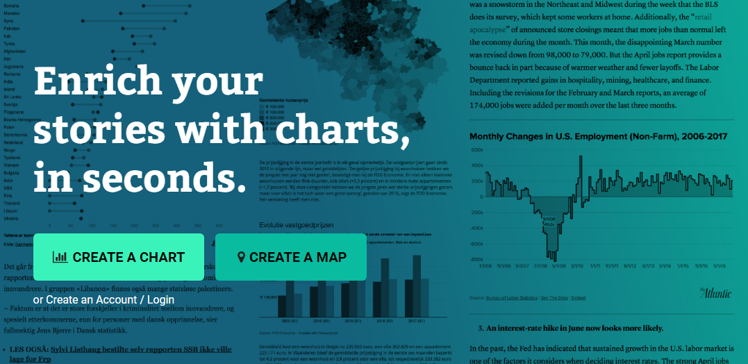
Datawrapper is an online tool that you can easily use to create stunning visuals for all of your presentations. It’s a user-friendly resource that allows you to quickly upload your data and select the right type of chart for your needs.
A few of the many options you can choose from including a line graph, a bar graph, a donut, a stacked bar graph, and others. You can also refine and annotate the graph as desired. In addition, through Datawrapper, you can even upload the graph to your own website in order to publish the graph for everyone to see.
Datawrapper is available in your choice of packages. There is a free package that offers the basic services, and also single flat, team, custom or an enterprise package depending on your needs and your budget.
2. Plotly
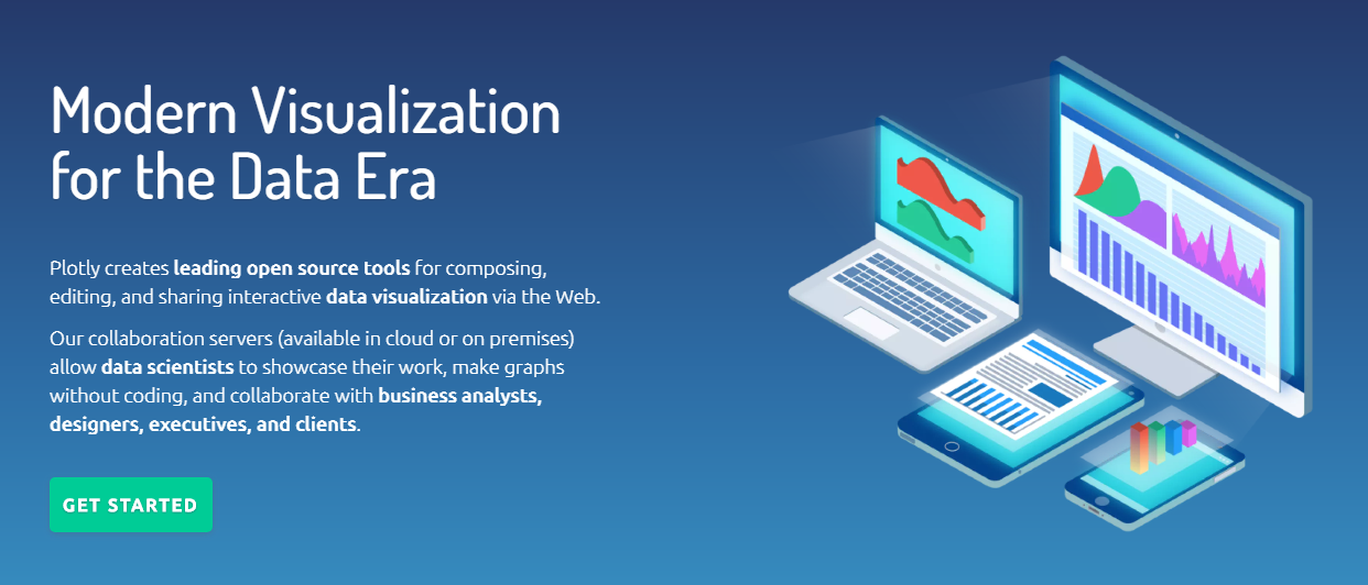
Another excellent tool that you can use is Plotly. This is an online resource that is designed with functionality and ease-of-use in mind. Once you simply upload a file in CSV or SQL to the website, you can choose from numerous chart styles.
Plotly takes this a step further by allowing you to create a professional dashboard as well. Your creation can be shared with others or published to a slide, a website, or another location. As is the case with the previous visualization tool, Plotly is available in various plans so that you can control cost and features.
3. Sisense

Regardless of whether you need to make sense out of your gathered data for your own professional needs or you need to create an attractive graph or visual to present in a meeting, Sisense is a great resource to use.
This is a highly evolved resource that can analyze huge volumes of data quickly. Its intuitive AI features, an agile platform and numerous tools and features are all designed to take the time and effort out of generating incredible visuals. The visuals can be used on-site, stored in the cloud or even embedded in your website. Pricing is available upon request.
4. iDashboards

While some visualization resources require you to have basic coding knowledge or to spend a considerable time crunching numbers to refine your data and visuals, iDashboards gives you an entirely different experience.
One aspect of this tool that stands apart from the rest is the usability. You can easily manipulate data and generate charts and graphs through a user-friendly dashboard. Everything from the type of the graph to fonts, color schemes, and more can be adjusted within seconds to meet your needs. There are also drill-down features to clarify your understanding of the complexity of your data. There is a free 30-day trial available for new customers.
5. Power BI

If you are accustomed to using Microsoft products, Power BI may be the tool for you to use. This is actually an entire suite of products that can be integrated with Office 365 and allow you to upload your own data.
Once you have data selected, you can create amazing visuals with minimal time and effort required. These can be published on a website, sent to different mobile devices and more. You can also create and manage a customized dashboard for additional benefits. Pricing is free for a basic version of Power BI, and the highest-level package is priced based on your unique needs.
6. Looker

If you are looking for a business intelligence and visualization program to work with SQL databases, Looker is a resource you should consider. Within minutes, you can upload a SQL database, and manipulate the data as needed inside the Looker platform.
Once uploaded, you can create dashboards or reports that have customized graphics representing your analyzed data. Looker is known for being user-friendly, and there are many resources to help you learn how to maximize its features and benefits. The company offers a free demo upon request, and can request customized pricing to determine if this is an affordable visualization tool for you to use.
7. Tableau Desktop

In order to create effective visuals from a large amount of data, you must understand the insight that your data provides. Tableau Desktop is one of the few tools that help you to understand your data and determine the best ways to organize it before creating charts and graphs. This can essentially make your visuals much more impactful and useful.
Tableau desktop also works with Google Analytics, SQL, Salesforce, Access, and other database formats that you may already be using. If your data is drilled down by region, you may love the fact that this program has easy-to-use mapping technology. After your free version expires, you can choose from several affordable plans.
8. Creately
Creately offers a powerful customizable table chart with advanced formatting capabilities and premade templates to create visually stunning table charts to organize your information and data. With this data visualization tool, you can arrange data in meaningful ways and interact with them to make effective data-driven decisions. We added creately to the list because of its Table Chart Maker tool which makes it easy to visualize, organize and analyze data.
Conclusion
You could simply include many spreadsheets of data in your reports and presentations, but this can be very challenging both for you and your audience. Fortunately, analyzing data and creating professional visuals within a matter of minutes, has never been so easy. Depending on your needs and abilities, you can now choose from a number of excellent data visualization tools and make your meetings more meaningful.
Nice reading it.. Very informative thanks for sharing with us keep rocking!
Hmm, good list, this is really useful, thank you!
One more great and useful article.
Thank you
Working in our industry, often times we need to present complex ideas in a simple, easy to understand manner. Many of these tools of are incredible for managing clients! Great list!
I am glad Bruno that you liked it. Can’t wait to share more amazing data visualization tools for meetings with you as they gets launched.